


by Judy

Black-and-white, often
abbreviated B/W or B&W, is a term referring to
a number of monochrome forms
in visual
arts. Black-and-white as a description may be considered a
misnomer in that the images are not ordinarily starkly contrasted black and
white but combine black and white in a continuum producing a range of shades of gray.
Further, many prints, especially those produced earlier in the development of
photography, were in sepia (mainly for archival stability), which yielded
richer, more subtle shading than reproductions in plain black-and-white.
Color photography provides a much greater range of shade, but part of the
appeal of black and white photography is its more subdued monochromatic
character. - Wikipedia-
Black and white images have a timelessness to them. They convey a classic beauty, and a touch of nostalgia. As you read in the information above, there is a lot more to black and white photography than simply "black" and "white." It's the many tones of grey which give an image its interest. Grey Scale is a spectrum of black and white which evolves into different shades and different depths of grey.
As Kelly mentioned in her post earlier this week,
removing the color from an image forces - in a good way- the viewer to see the
other elements in the photo. Not all photos work well for black and white
conversions, but I'm going to show you a few that I believe do work. You
will see that my subject, and its level of light and shadows, help me to
determine which shades of grey I will use.
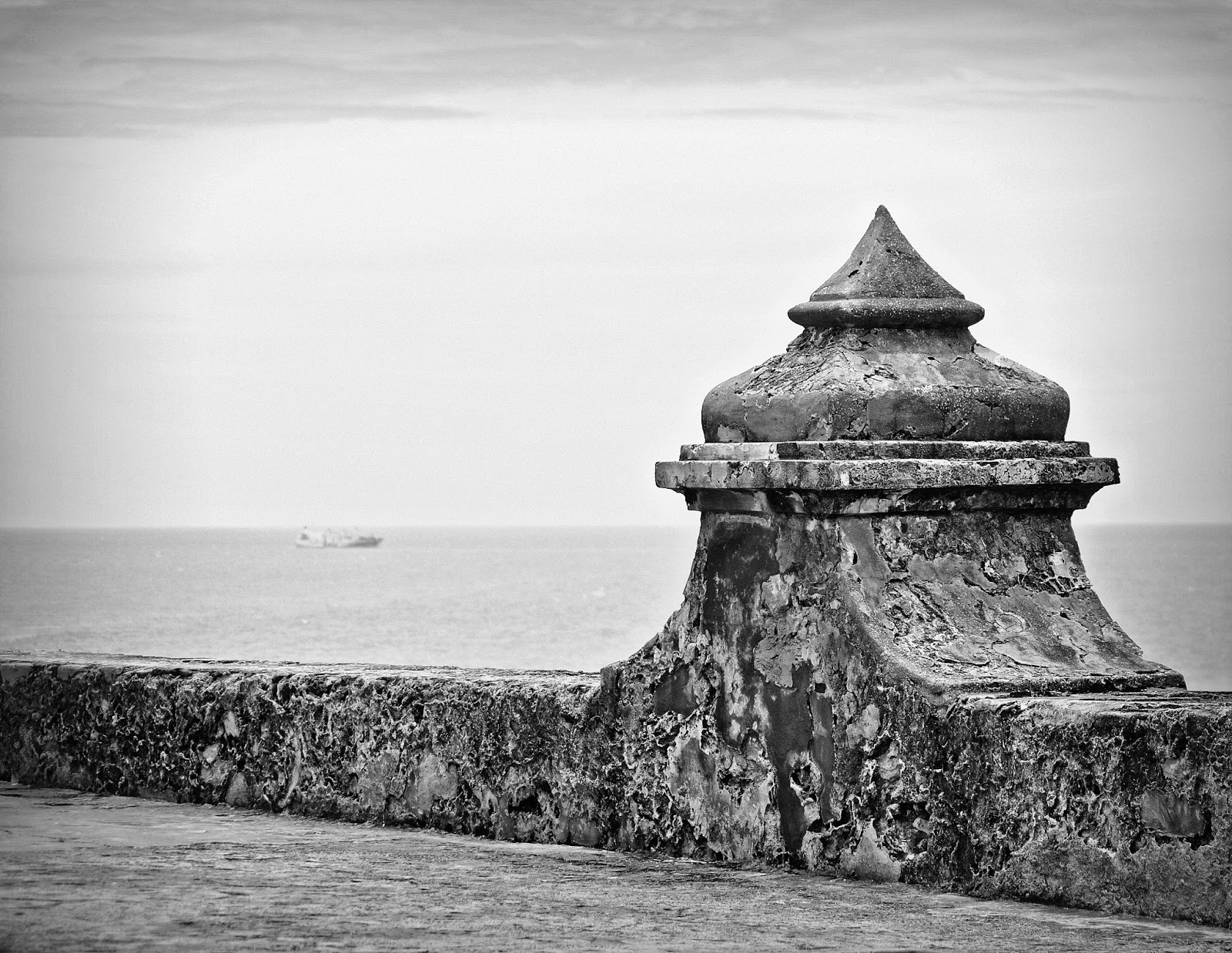
The above photo, which I call The Fort, works well as
a black and white image because the simple, strong lines and shape of the fort
wall - in contrast to the much lighter backdrop of the ocean - creates
interest, and draws your eye to the form and texture. For this photo I
chose to convert in a "traditional" black and white style, with
darker blacks and whiter whites.

The fine details and strong textures of the urns in the above photo give my black and white image depth. Look for images that are side lit, which will bring out more of the detail of its texture. I felt that the "traditional" black and white conversion left this photo too dark, even when I bumped up the lights and highlights. I chose to convert this image in Selenium tones of grey because this process increases the range of visible shades of grey, without reducing the contrast in the photo.

This sea urchin is a great subject for black and white conversion. Its simple shape, combined with all of its fine details, really pop in black and white. I found, however, that I liked the feel of the photo much better when converted to this soft sepia tone. As always, how you choose to convert your image will depend on the 'feel' you want the image to have. I liked the aged look of the sea urchin and the almost vintage post card look this type of processing gives it.

Again, normally in black and white photography you look for subjects and lighting that will translate into a wide range of grey tones - from dark blacks to white whites - like those shown in the previous images. There are times though that you can get great results when your subject is mostly light (high key). I found that my image of the high key dogwood blossoms worked beautifully in black and white, even though the tones of grey are very subtle throughout.
I hope that you use this month's Black and White theme to play around with your images. Even if you're a "color" person, like Kelly, and many of us, give it a try. I think you will be amazed at just how beautiful your images can be, and you will see why black and white photography has stood the test of time.


7 comments:
I love this post! You are hitting on many of the reasons that I love B/W as much as color. There is so much to work with and so many variations to choose from. Your images are amazing -especially the sea urchin, for me, and the fort.
I would also encourage you all to read through your camera menus. My Canon and many of the Nkon models have a way to set up your view finder to show you the scene in black and white, even if you choose to make the actual picture color. My camera, when set up that way will give me a black and white and a color next to each other in lightroom for every picture. It really helps to use this setting to explore your possibiites as you are shooting
this is so great judy. and you images are just so beautiful. wow. this month is really teaching me to look at things differently. which i think is always agood thing.
Great post Judy. Love all of your images so much
I love a good b&w...there is something so very timely and classic and elegant in a good black & white photo and yours fall right into those categories. Absolutely love the image of the "fort"
Oh, I love all your photos today, Judy! But the sea urchin as to be my favorite of the bunch. And I always love a good tutorial! Great for our monthly theme ... thank you so much.
Beautiful photos! I love how B&W brings out textures! Thanks for the tips!
Well, I thought summer was supposed to be lazy! Ha! It seems if I don't get here to comment first thing in the morning, it doesn't happen until late in the day. I think I need to go back and reread Deanna's post last week!
I love every single one of your b&w conversions but that sea urchin . . . sigh! Just stunning! Thanks for demonstrating the different kinds of b&w with your beautiful images. They tell me I need to make some time to play!
Post a Comment
Thank you for sharing part of your day with us. If for any reason you are unable to leave a comment here on this post, please leave your comment on our Facebook page or in our Flickr discussion group. We love hearing from you!